4 Signage Elements to Consider When Building an Effective Pylon Sign for Your Business
If you’ve ever walked down a busy street, you’ve probably seen dozens upon dozens of signs advertising local restaurants, haircut parlors, and knickknack shops. Signage is one of the most efficient ways to extend a business’s reach beyond the storefront. In fact, FedEx’s 2012 Office Survey reports that
76% of American customers have entered a store they’ve never visited before purely because of the sign.
Having a sign clearly should be a high priority for business owners. If you want to increase your business’s reach, here are some of the things you should consider when designing your own.
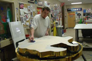
1. Choosing the Materials for Your Pylon Sign | Signage Toronto
Whether you want a banner hanging off the side of a building or a pylon sign simply sitting near the road, you need to choose a sign material that matches your use case well. Some of the most common materials include:
Vinyl banners, which are fragile but allow a great selection of colors to be used
Plastic, which is far more durable and weatherproof. Plastic is great for a low maintenance sign positioned outdoors.
Metal, and especially rust-proof aluminum, is even more durable but may be more expensive
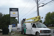
2. Sign Placement | Signage Toronto
Even the greatest signs will be ineffective if no one can see them. When choosing where to place your sign, find where the most traffic occurs to maximize viewership. Orient the sign so that people walking or driving from both directions can see it. Restaurants and shopping centers, for example, use large pylon signs to advertise to busy streets.
Make sure the sign is not obstructed by other objects like trees or bushes. Also, consider investing in lighting to make it visible at night.
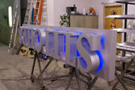
3. What Content to Include | Signage Toronto
Know what the focus of your sign should be. While it’s generally advisable not to use more than two fonts in a sign, vary your font size so the most important information is emphasized.
Have the company name and service provided shown in big letters. Potential customers need to tell at a glance what your company offers.
Contact information, like a phone number and short website link if applicable, is second in line with a medium font.
Low priority elements like a slogan may be in a smaller font
Most people just skim signs, by the way, so keep your text terse. Also, add some type of graphic (a logo or basic line drawing) so the sign doesn’t seem too dull.
4. How It Should Be Formatted | Signage Toronto
Sometimes less is more, and business signage is no different. Having too many graphics and decorations may seem too gaudy and make reading the sign difficult. Ensure the typeface you use is readable. Cursive and all-caps typefaces can grab people’s attention quickly, but use them sparingly as they can be hard to read as well.
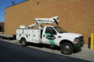
About Vital Signs – Toronto, Markham, Richmond Hill, Concord, Newmarket, and the GTA
As you can probably tell, there are tons of aspects to consider when designing an effective business design. If you want to leave some work for the professionals, consider contacting us at Vital Signs.
With over 25 years of experience, we can maximize your impact on the public’s perception of your company and help you take advantage of Toronto’s heavily populated streets with your business’s sign.
• A solid pylon sign is a vital part of success for many businesses.
• When designing one, take into consideration sign material, placement, content, and format.
• A great deal of effort goes into making a sign. Contact the experts at Vital Signs if you want the professionals to help out.